help
HELP REMEDIES
Packaging Design
Product Design Strategy
Out-of-Box Experience
Help Remedies is a line of OTC medication aimed at making simple health issues simple.
As a startup in the over the counter medication aisle, Help Remedies needed a high visual impact to differentiate and to capture the attention of consumers and bigger retailers.
The line consists of 6 products that are designed to help guide the consumer through the medicine aisles with ease and comfort. The product approach is clean and minimal with enough coding and approachable cues to clearly articulate the contents as directly as possible.
Working closely with the founders and Little Fury, we helped create two generations of sustainable packaging designs that enjoyed a great impact in the market, helped start a conversation about the over-prescribing of medication in the U.S. and helped save precious marketing funds by garnering lots of attention in the press.
The “concept car”
It began with an insight that the over-the-counter medication aisle in pharmacies is overwhelming; too many brands and products, confusing ingredients and claims - it all adds to noise just when you need calm and clarity.
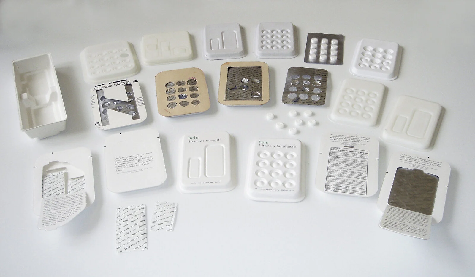
We designed the first generation of the package with the notion of creating a “concept car”, with the intent of disrupting the conversation and getting the attention of the media and non-traditional retailers, like hotels, design and home goods shops.
The design expression is a result of the idea of communicating the contents via the topography of the surface, paired with the softness of a pillow, creating a calm and soothing voice; which is what one craves when under the weather. Utilizing paper pulp, we were able to translate the design concept into a recyclable package.
Less is better (for you)
Less Drugs.
All of Help Remedies solutions are made with a single active ingredient. Help, I have a headache, for example, contains only acetaminophen, where as some other headache medicines may contain two or three active ingredients.
Less Dyes.
The drugs themselves are made with the fewest possible coatings and dyes. Many drugs are colored and coated for decorative purposes.
Less Confusion.
Each product is labeled after the specific symptom it is meant to solve, e.g. Help, I can’t sleep, instead of an unrelated brand name, so people understand clearly what they are taking and what they are taking it for.
Less Waste.
Help’s packaging is made from paper pulp and cornstarch-based plastic. The components can be separated after use and each part can is either recyclable or compostable.
Sustainability, evolved.
After a successful launch of Version 1, we quickly followed up with an improved Version 2 that maintained the original concept of the pillowy topography but introduced a resealable frame that is made from compostable bioplastic. After use the parts are easily separated for recycling. The line was also expanded to 6 products.


